In shapes and colours: a history of Societe Generale's visual identity
From its first monograms to the red and black square, passing via the Pasquier logo, Societe Generale's visual identity has evolved over time in response to ever changing requirements in terms of communication and visibility. The following is a look back at how this strong symbol of the Group's identity was formed.
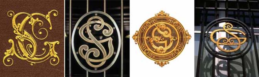
During its first few decades in operation, Societe Generale followed no specific visual identity guidelines and had no standard logo in the proper sense of the term. To differentiate from the competition, the bank's full name was displayed on front walls and on signs in large capitals or in gold: "Société Générale pour favoriser le développement du commerce et de l’industrie en France" ("Societe Generale to support the development of trade and industry in France"). The "SG" monogram made its appearance at the end of the 19th century. With no calligraphic unity, it appeared in wall mosaic form or as interlaced letters. This was not unusual. The "logo" concept remained undeveloped up until the First World War. The use of a stamp was the custom of industrial companies, notably in the automotive, food and oil exploration sectors, for which they had to chose a sign that would be visually recognisable by consumers.
This all changed during the golden period known as the Glorious Thirties. At this time in France, there was an exponential increase in the rate at which people began to use banking services, with the result that major banks began to seek a more distinguished visual identity to attract and retain customers. Quicker to read and more effective than spelling out their name in full, a logo became a necessity. Societe Generale made the leap in 1969 with the "Pasquier logo", from the name of its designer, the painter Noël Pasquier. Inspired by kinetic art, very much in trend at the time, the logo's message was to reassure: its round form represented the earth, unity and security. As an inverted spiral in dark brown and beige, it gave the impression of perpetual movement, symbolising a horn of plenty which perpetuated the bank's ideals. Tradition and modernity, seriousness and imagination, solidity and dynamism were all suggested by the logo. Several variations followed. In ten years, the typeface used for the words "Societe Generale" changed four times (1971, 1976, 1977, 1981) and the design was adjusted in various colours. But such experimentation was not to last. The start of the 1980s saw the introduction of stricter graphical standards for developing a visual identity. In 1983, "madder red" and ivory were selected as colours, with the logo spiral in red and adjusted in proportion to the typeset of the company name.
In 1989, Societe Generale decided to redesign its visual identity. Two years after its privatisation, it wanted to refresh the image it communicated and its visibility. Following mass deregulation of the banking sector, competition became tougher on a market that had previously been state-dominated. After an attempted stock-market raid, of which Societe Generale was the target, the Group sought to revamp its image by highlighting its specific qualities and independence. Studies showed an urgent facelift was necessary and recommended the adoption of a new "sober, elegant and more modern" logo. With this, the management hired Sopha, a design agency owned by the RSCG group, to design a new visual identity. The result was a highly symbolic red and black square, with "Societe" written in black on red and "Generale" written larger in white on black. The square evokes solidity, strength and rigour while the colour contrast indicates the balanced relationship between the bank and its clients. Red, which is bright and dynamic, is associated with passion and emotion, while black is the colour of solemnity, seriousness, and institutions. The white bar symbolises openness. The larger typeset suggests the bank's capacity for flexibility and adaptation. Success at last. Much more than a logo, a real brand was created.

It was adjusted in 2005 with a view to harmonising it and making it easier to read. This led to the graphic being shown on the left and the company name on the right. Five years later, the signature text, one of the bank's values, was added, addressing all of its clients and employees: "Building team spirit together".
© Archives historiques Société Générale, J.-M. Cras, BM